Defining the visual strategy and branding for property developer House by Sanz
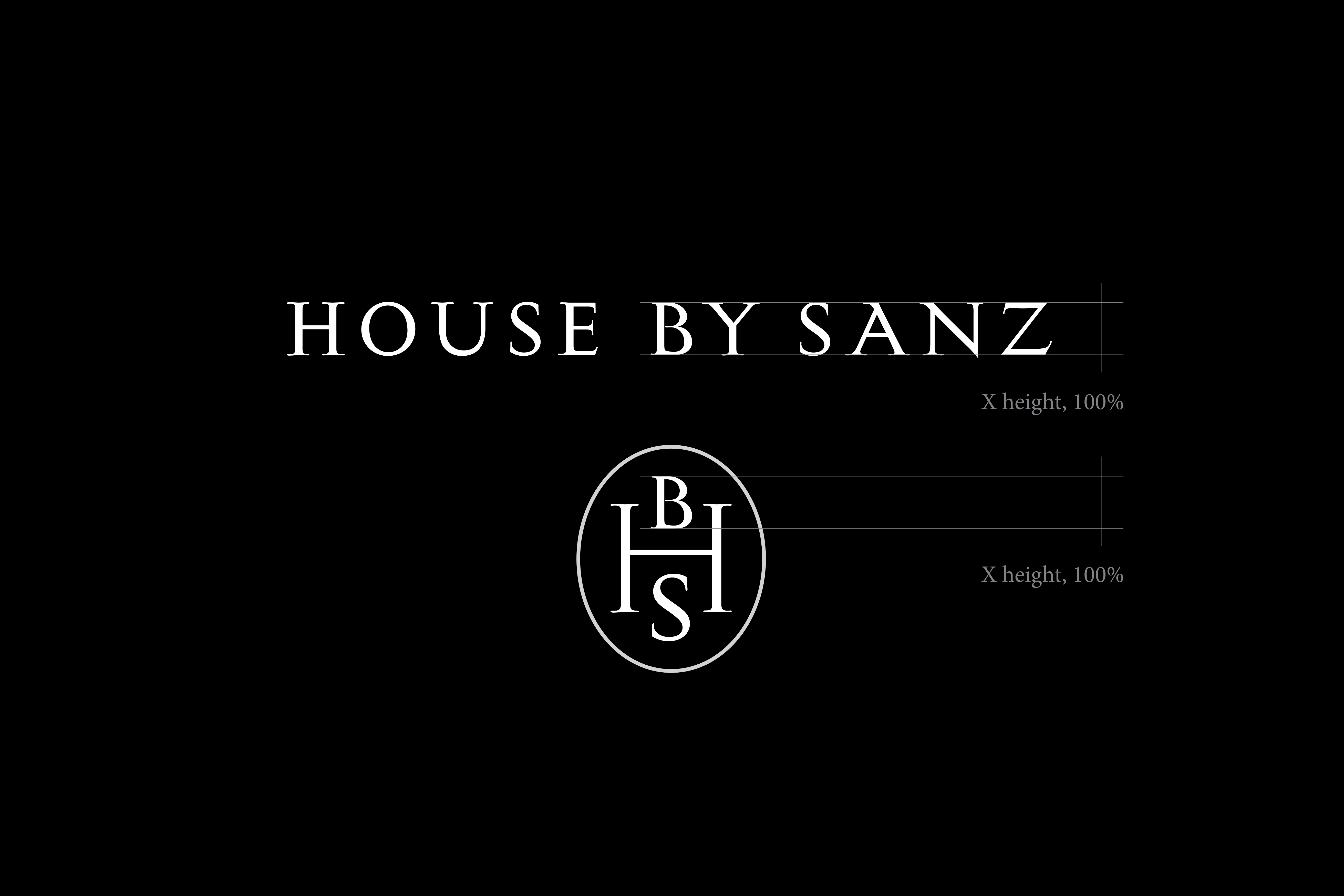
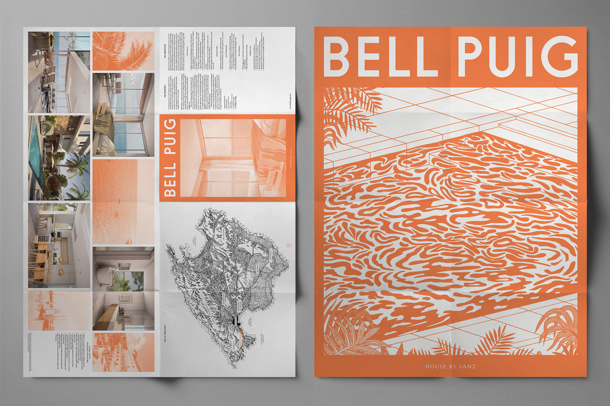
Bespoke display typeface creates a consistent visual identity for each individual development
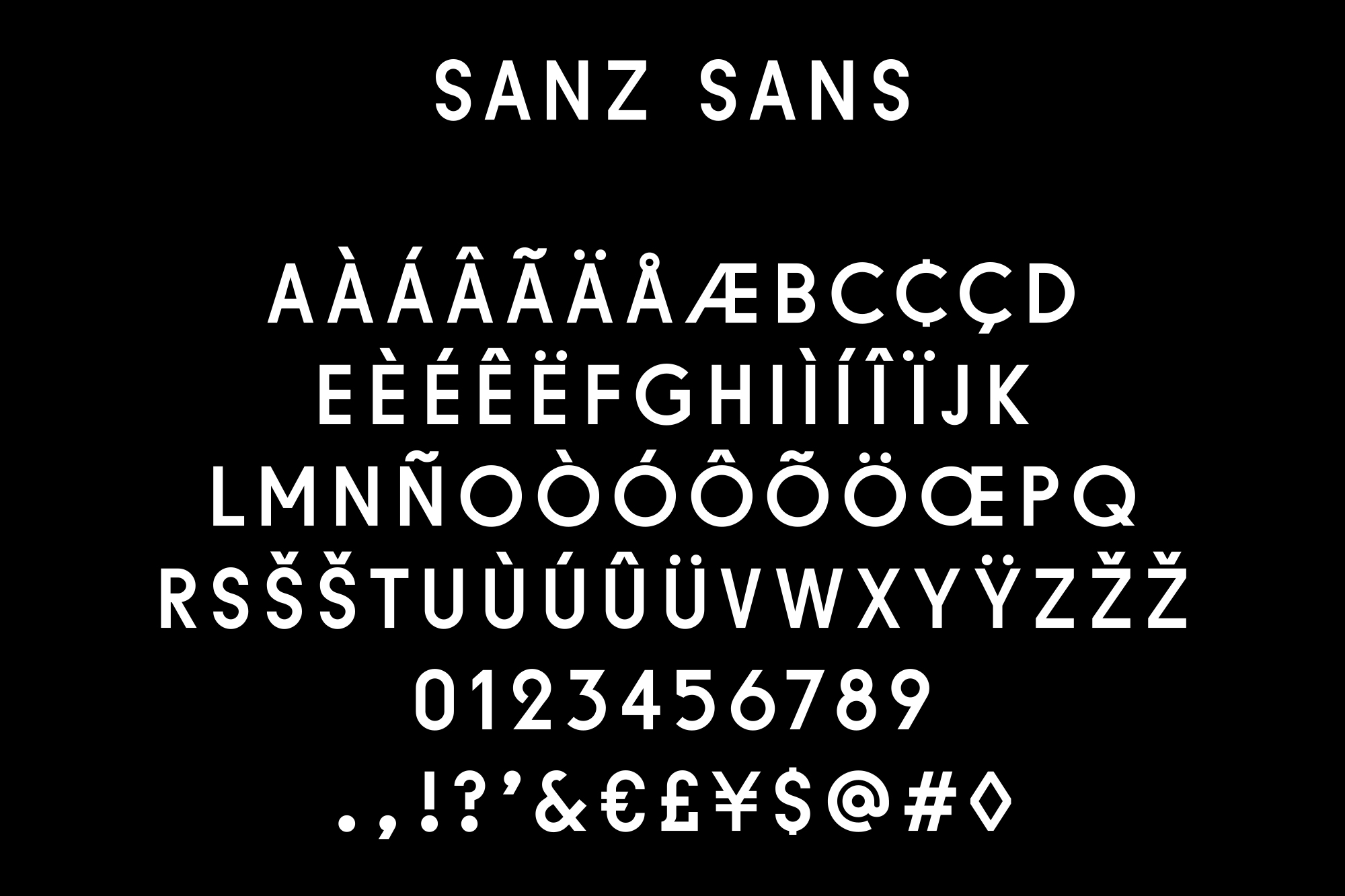
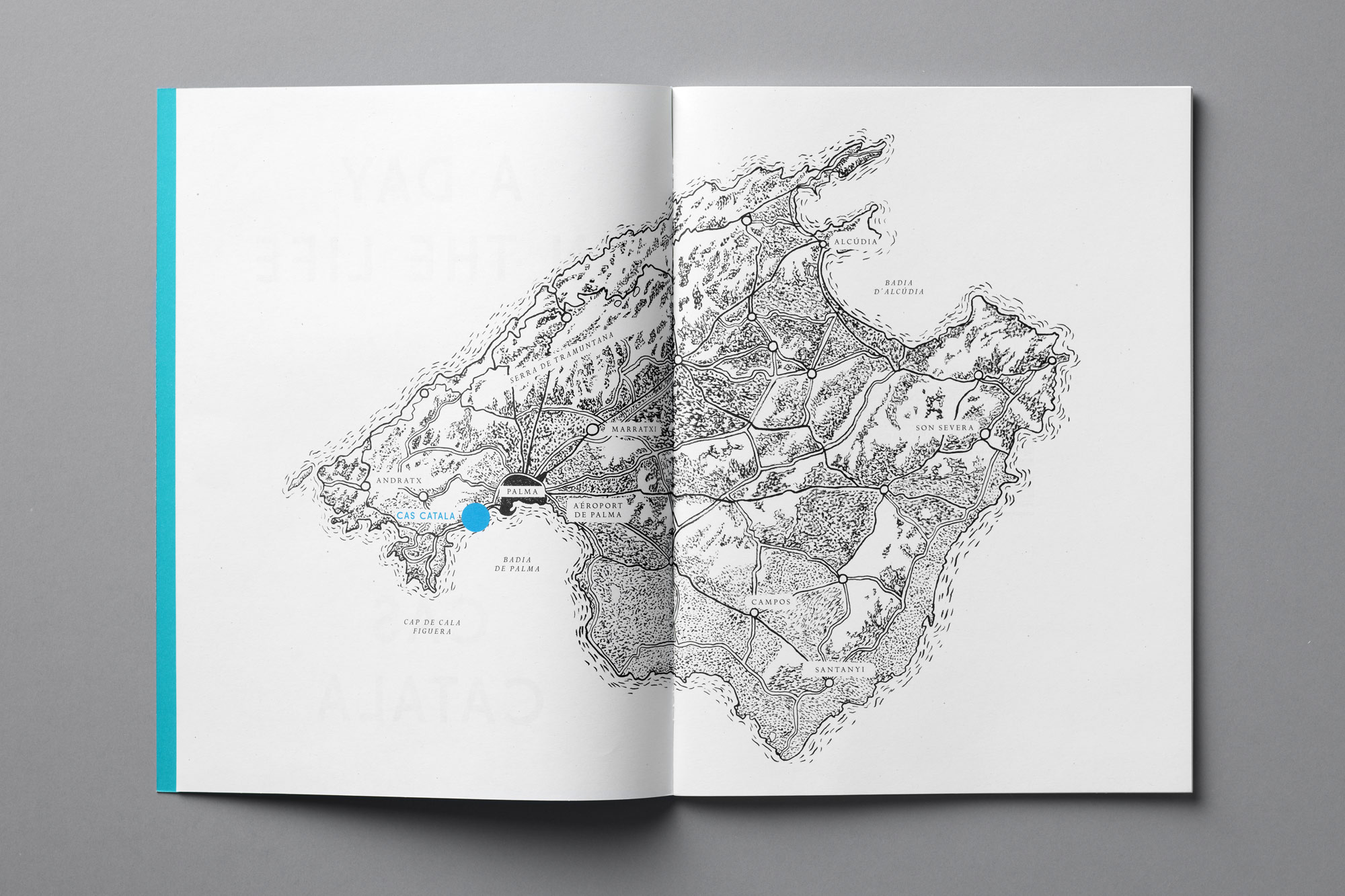
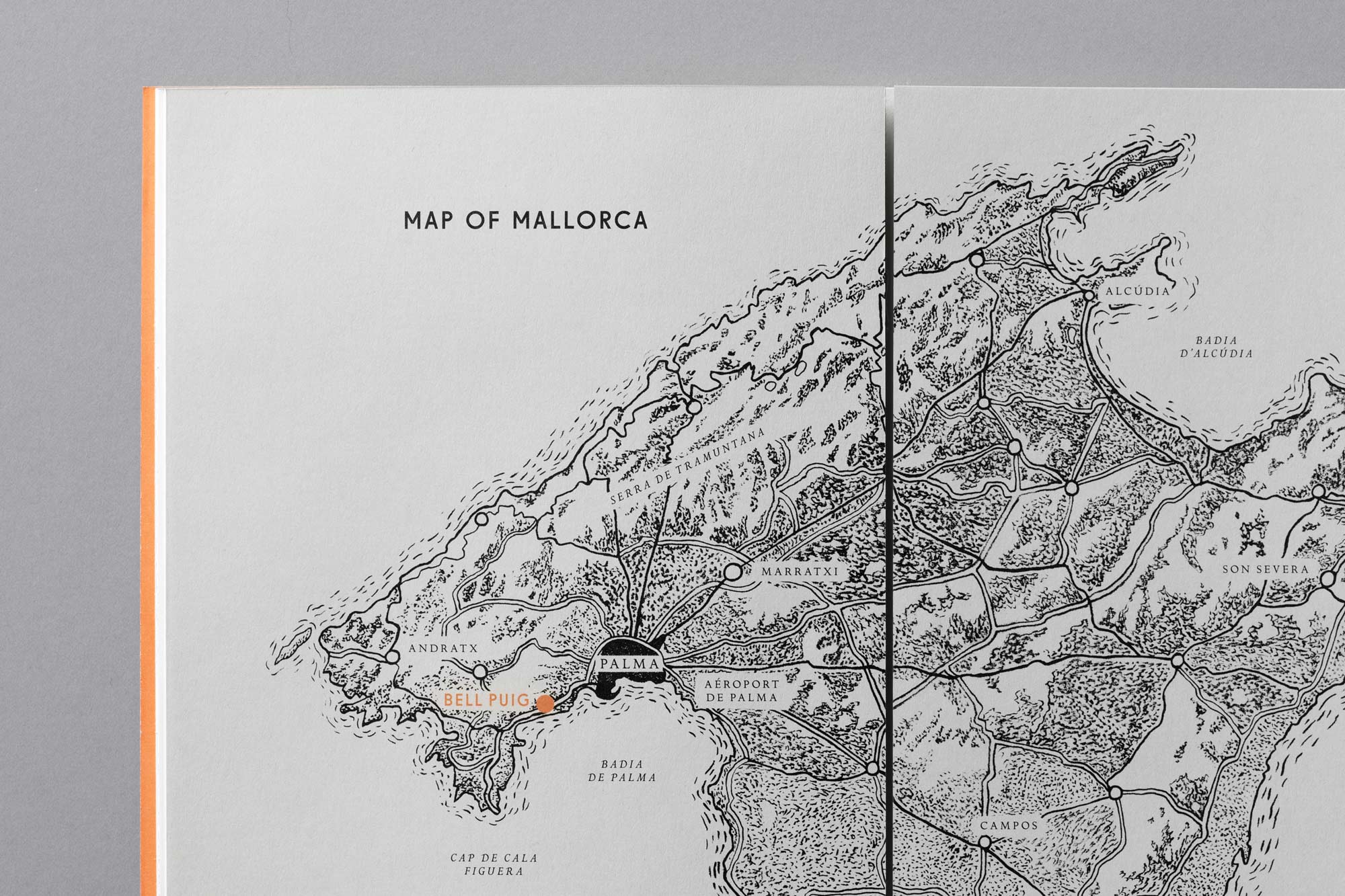
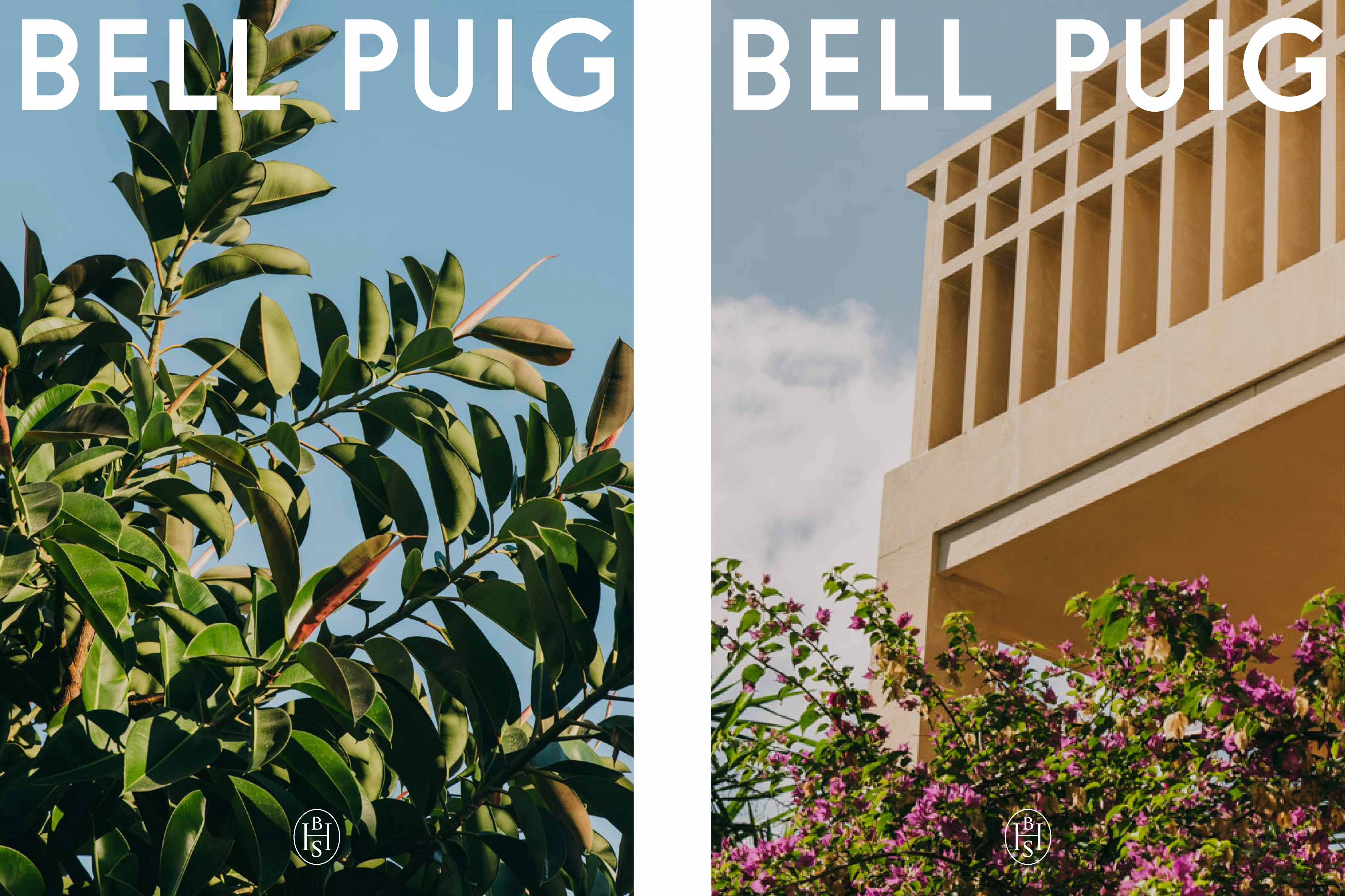
Brand signatures reference classic Mediterranean façades in their lettering characteristics
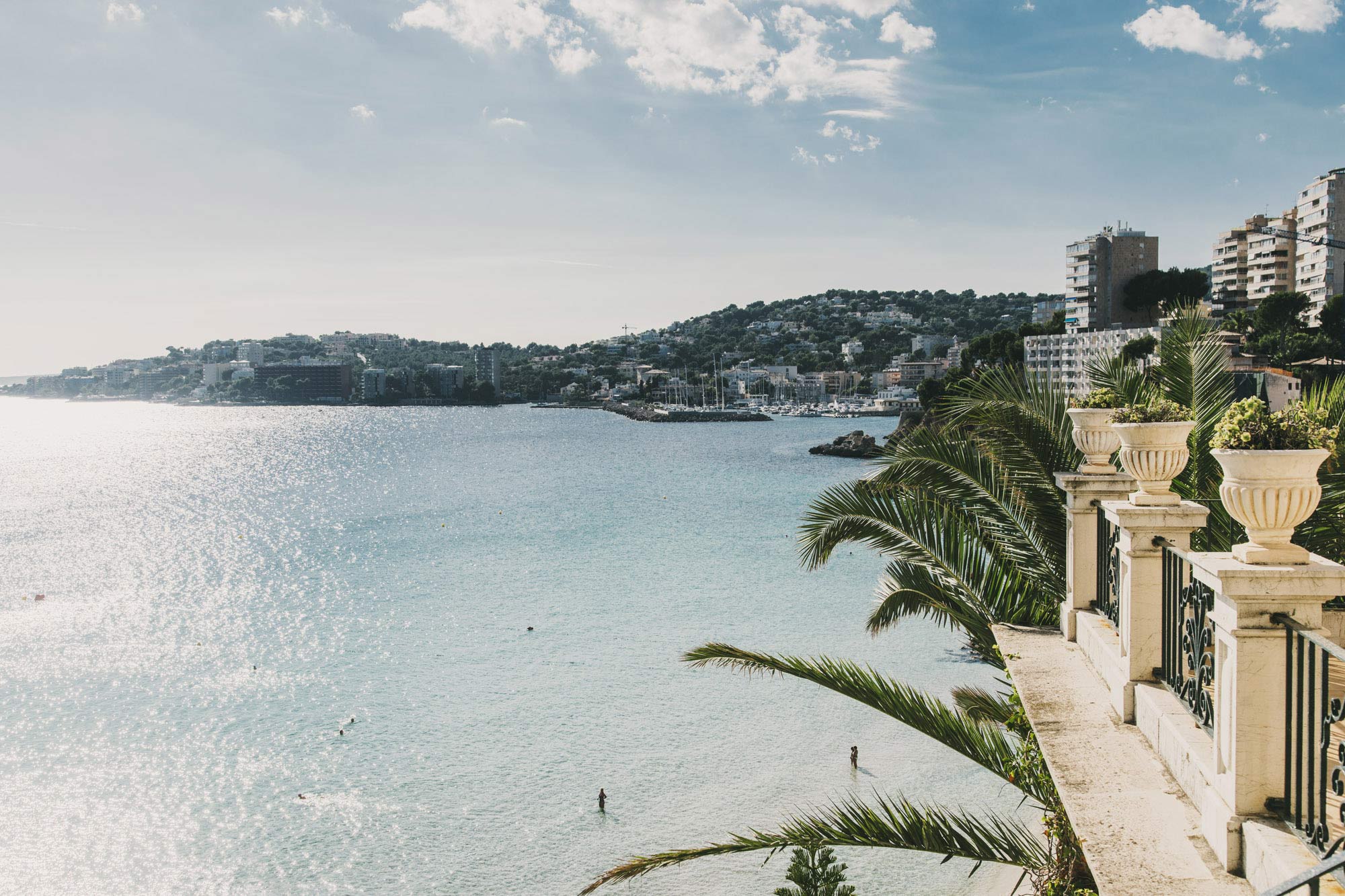
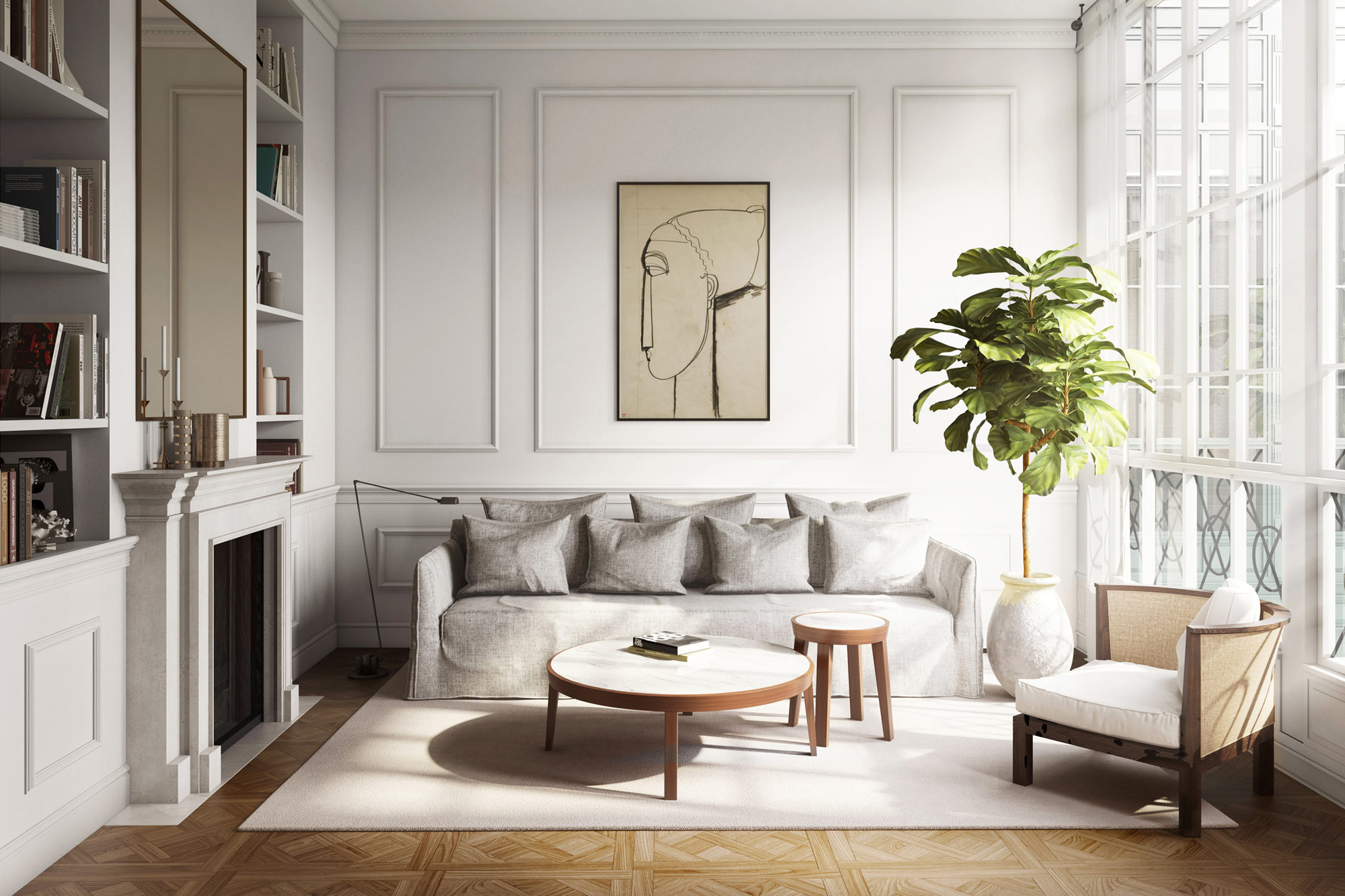
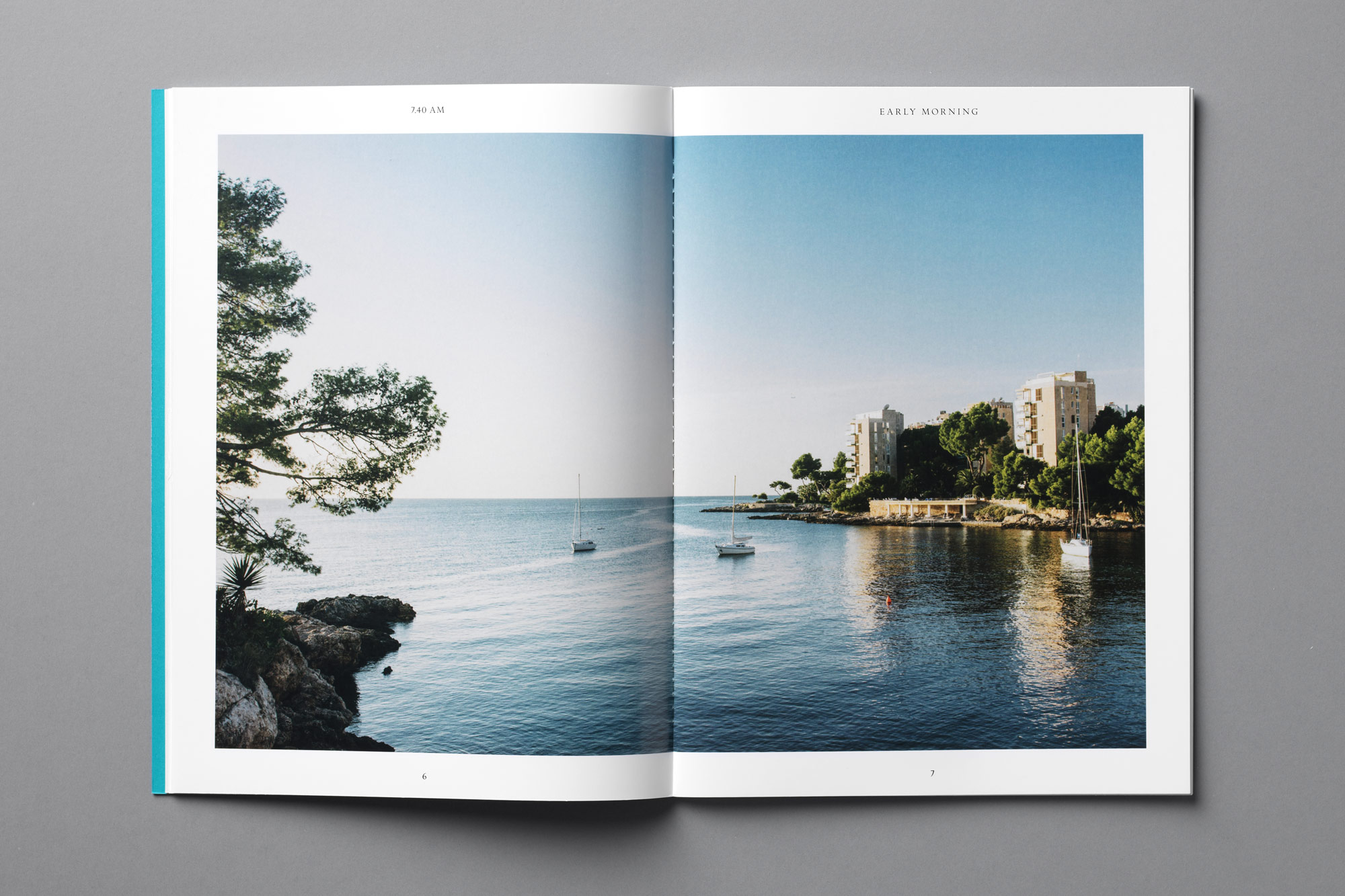
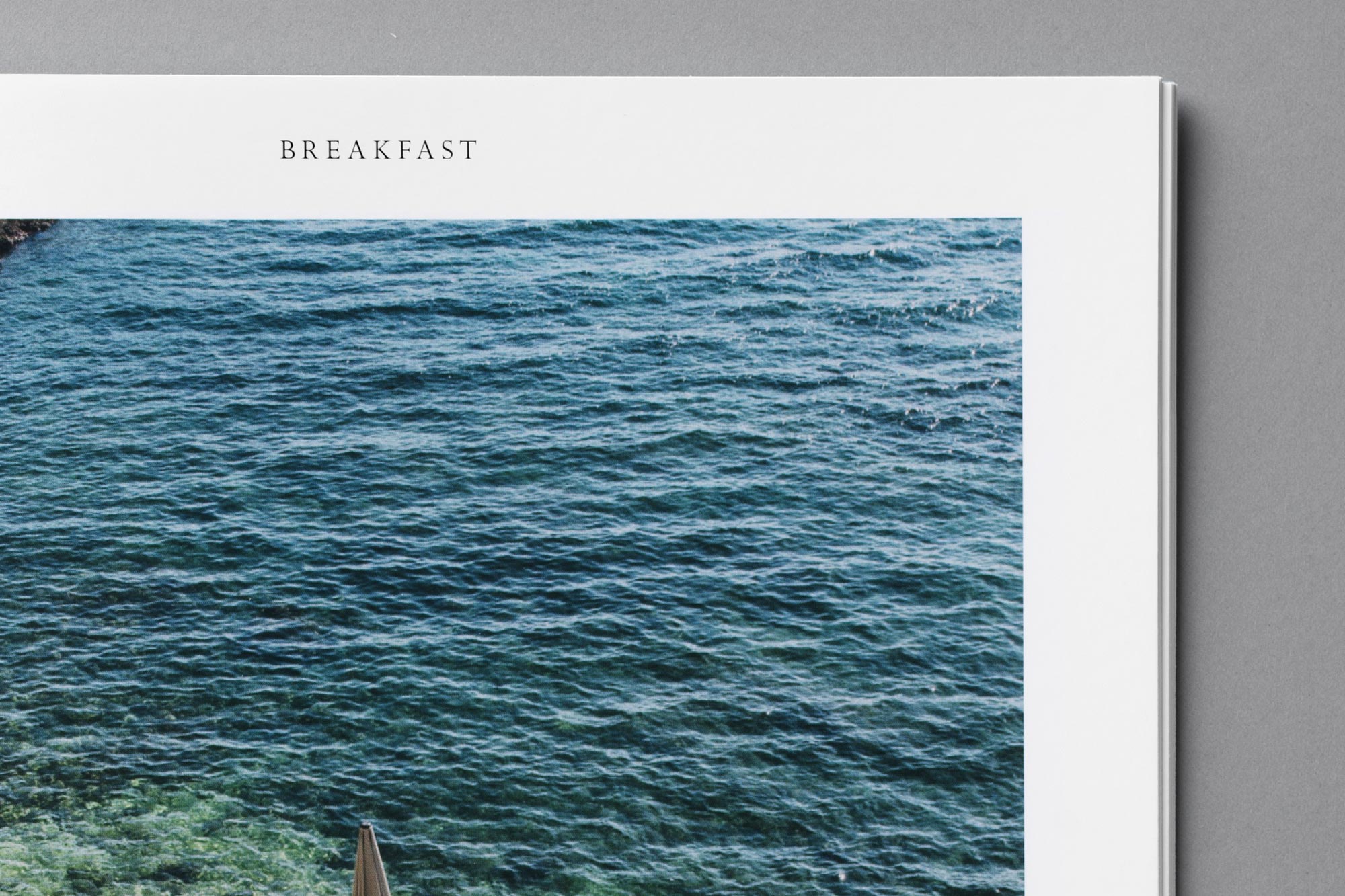
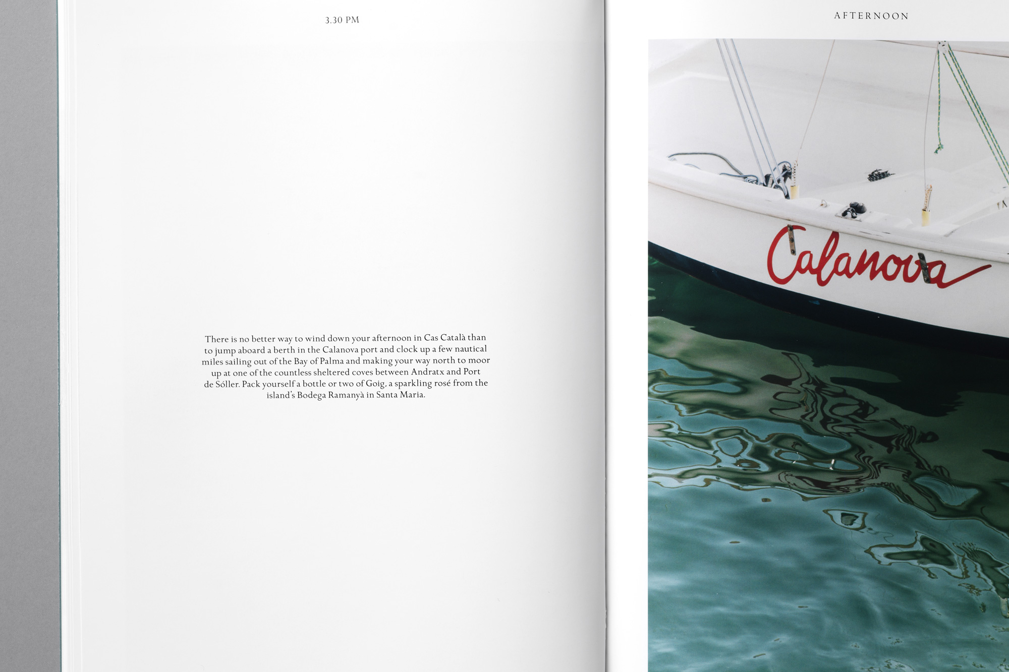
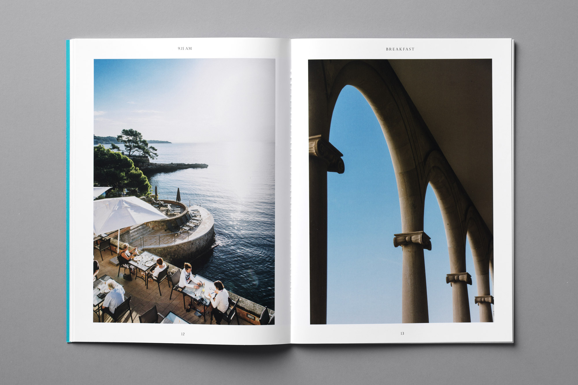
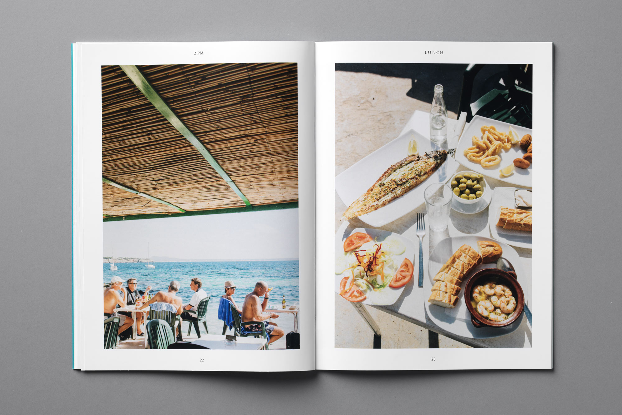
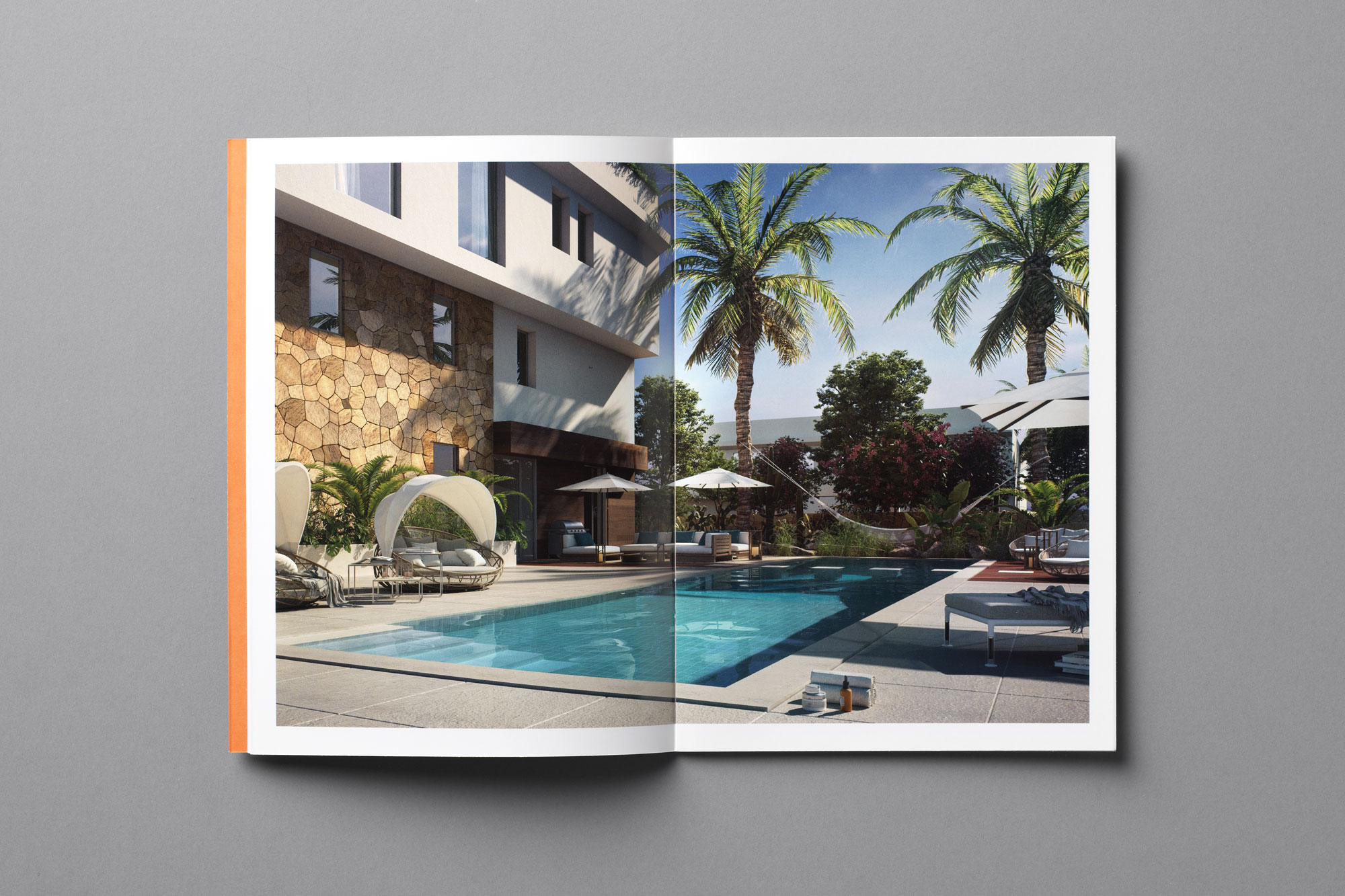
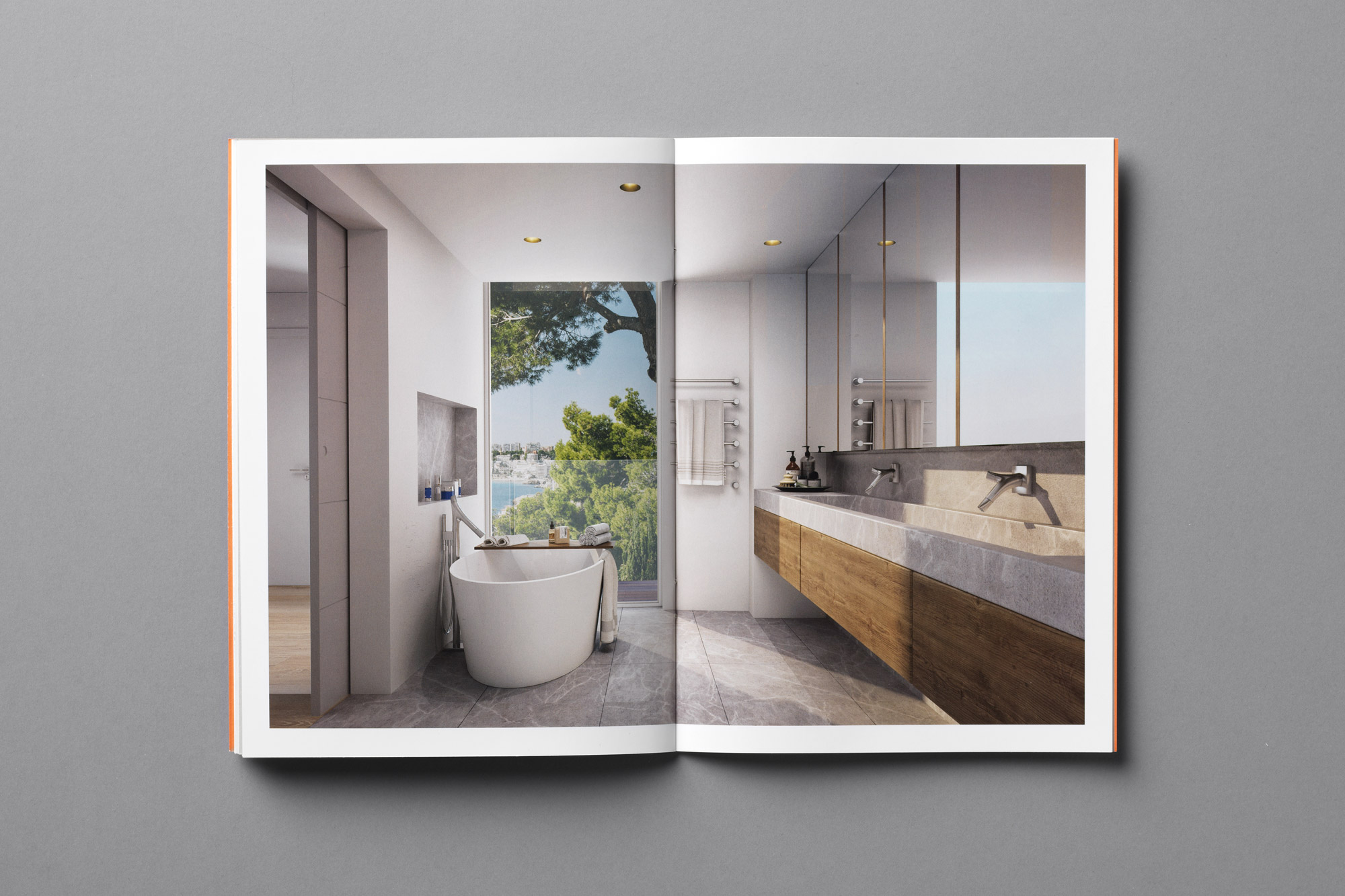
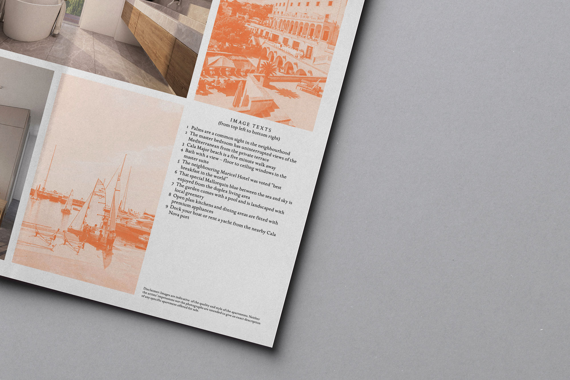
Art direction of imagery reflects the true sense of place and the neighbourhood surroundings
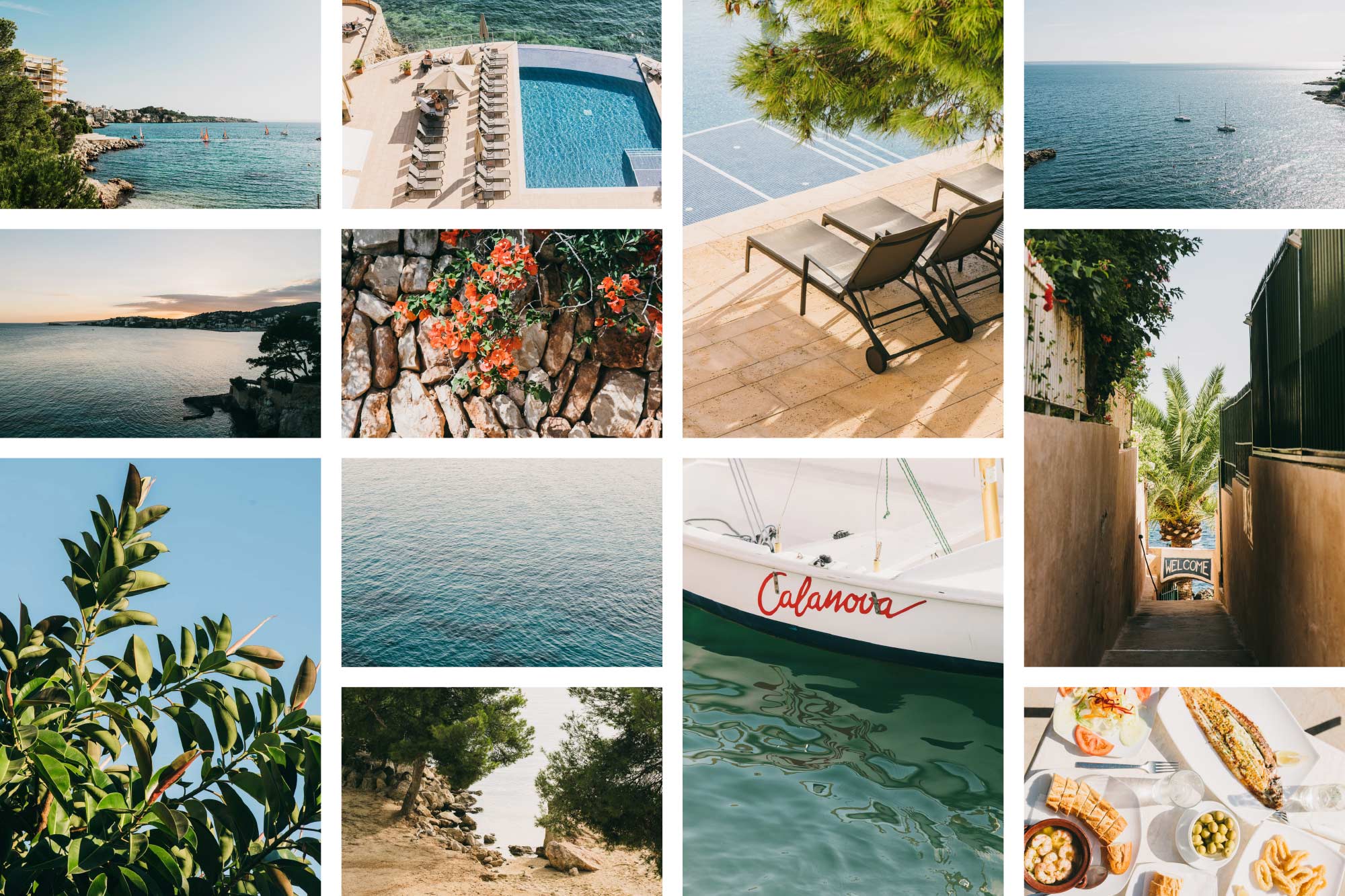

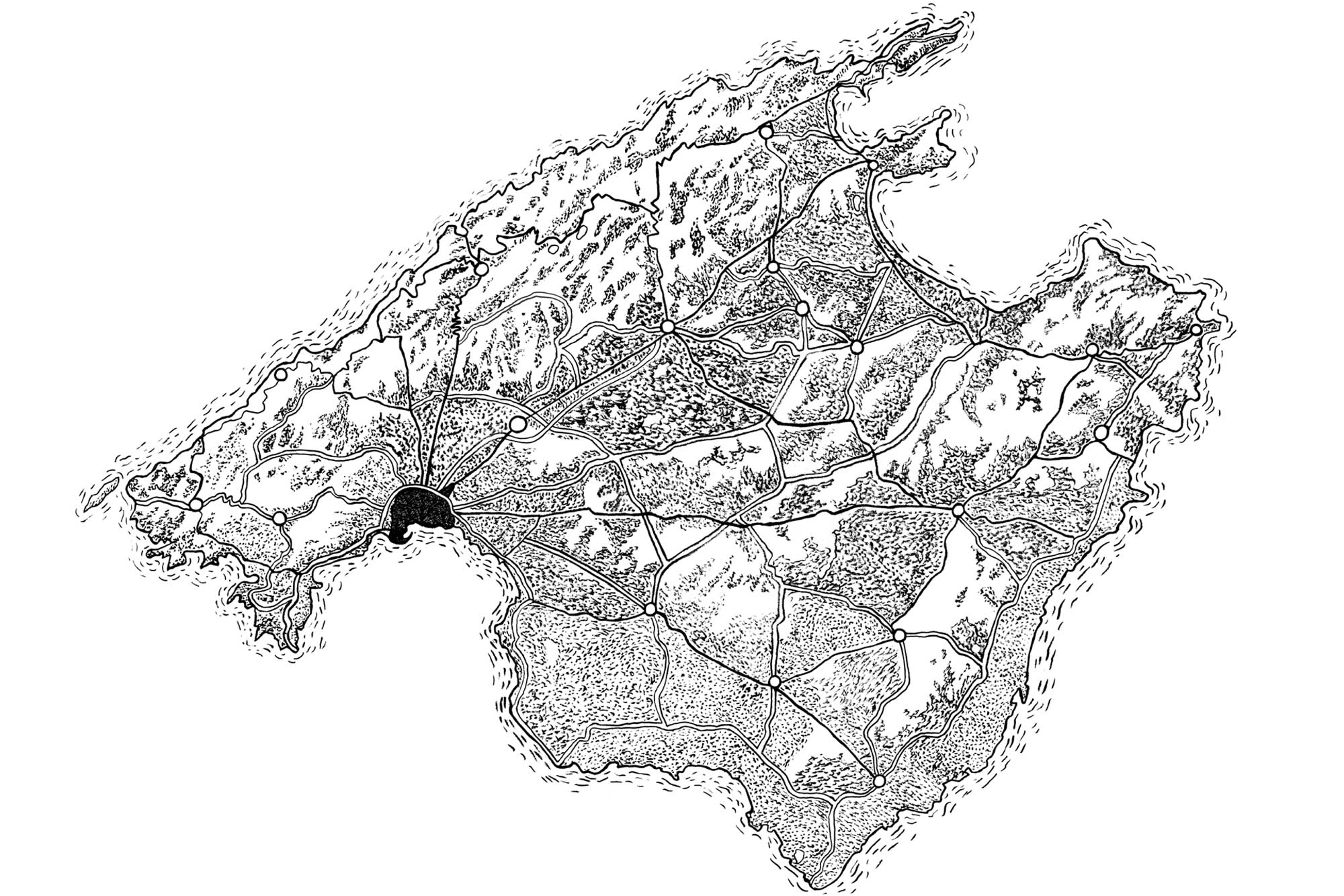
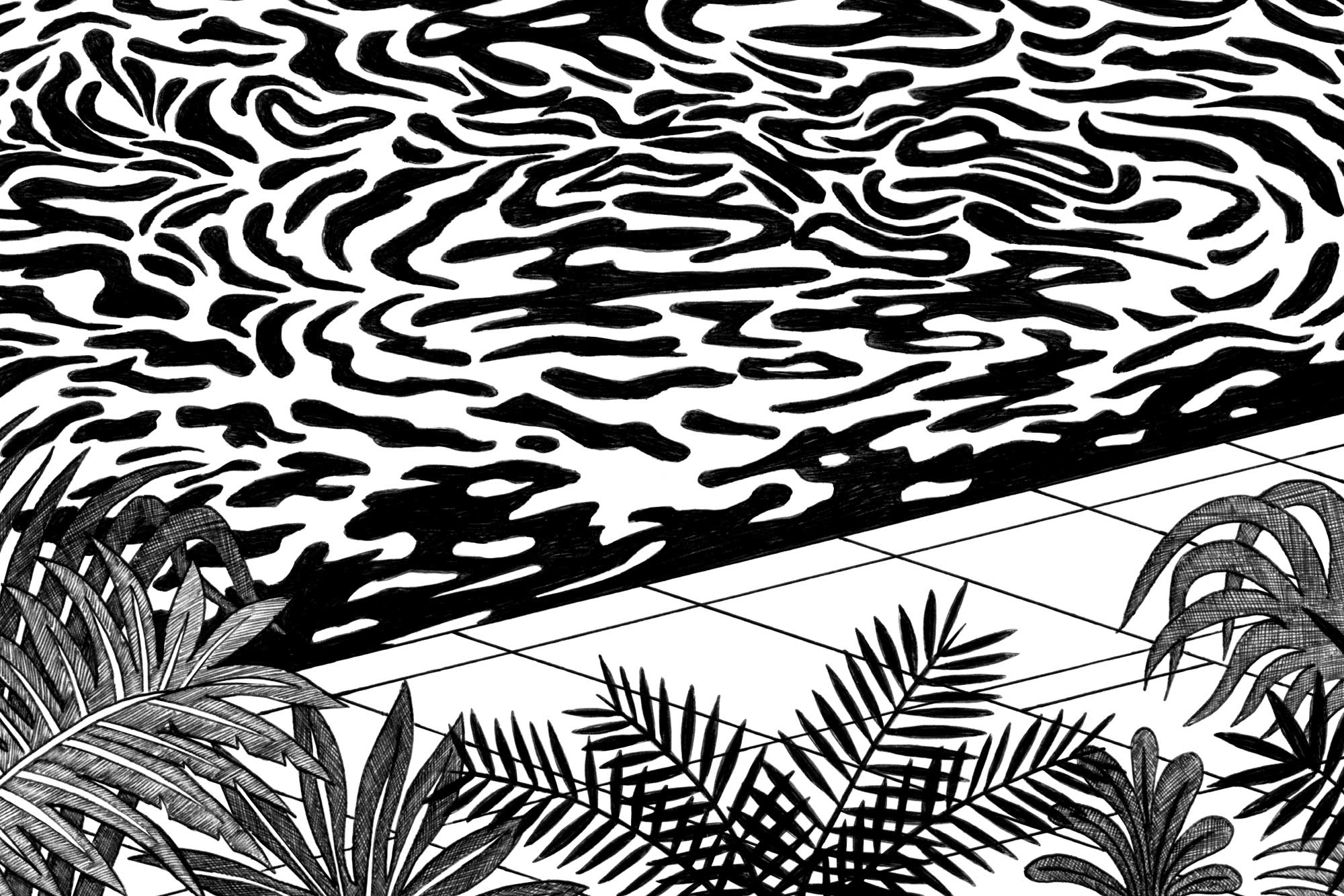
Illustrated motifs capture a mix of people, objects, stories and landscapes
Digital presentation designed to inspire by expressing key local insights
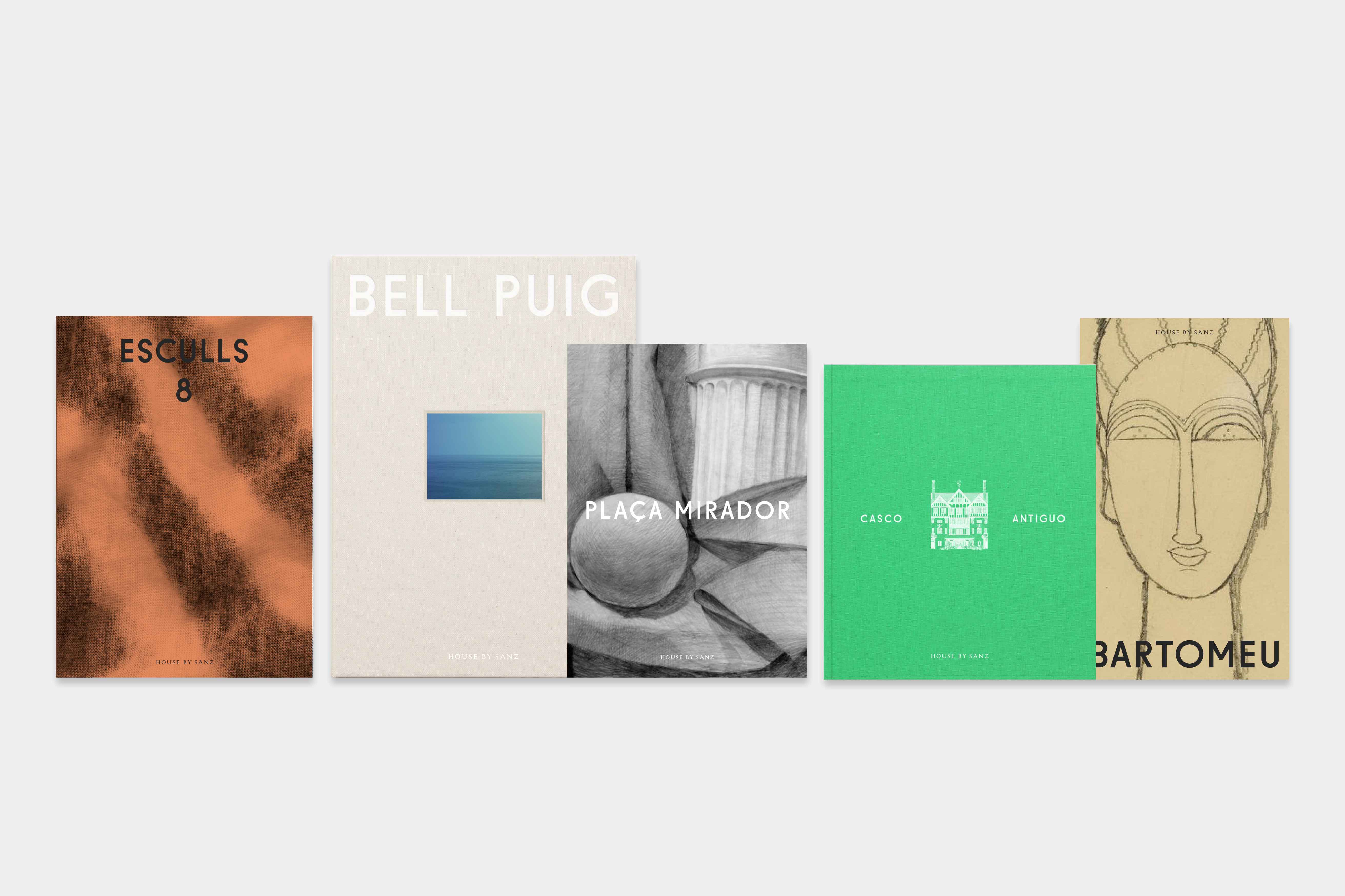
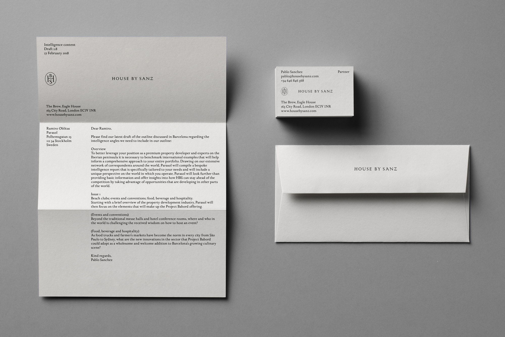
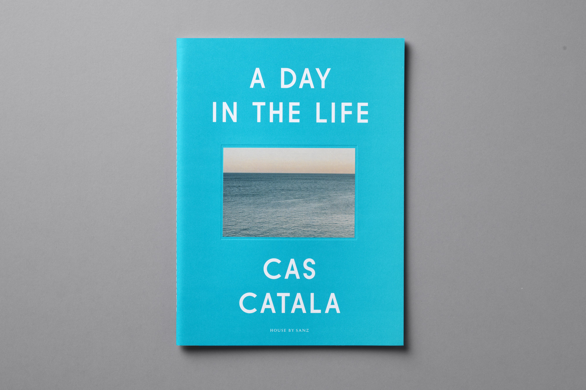
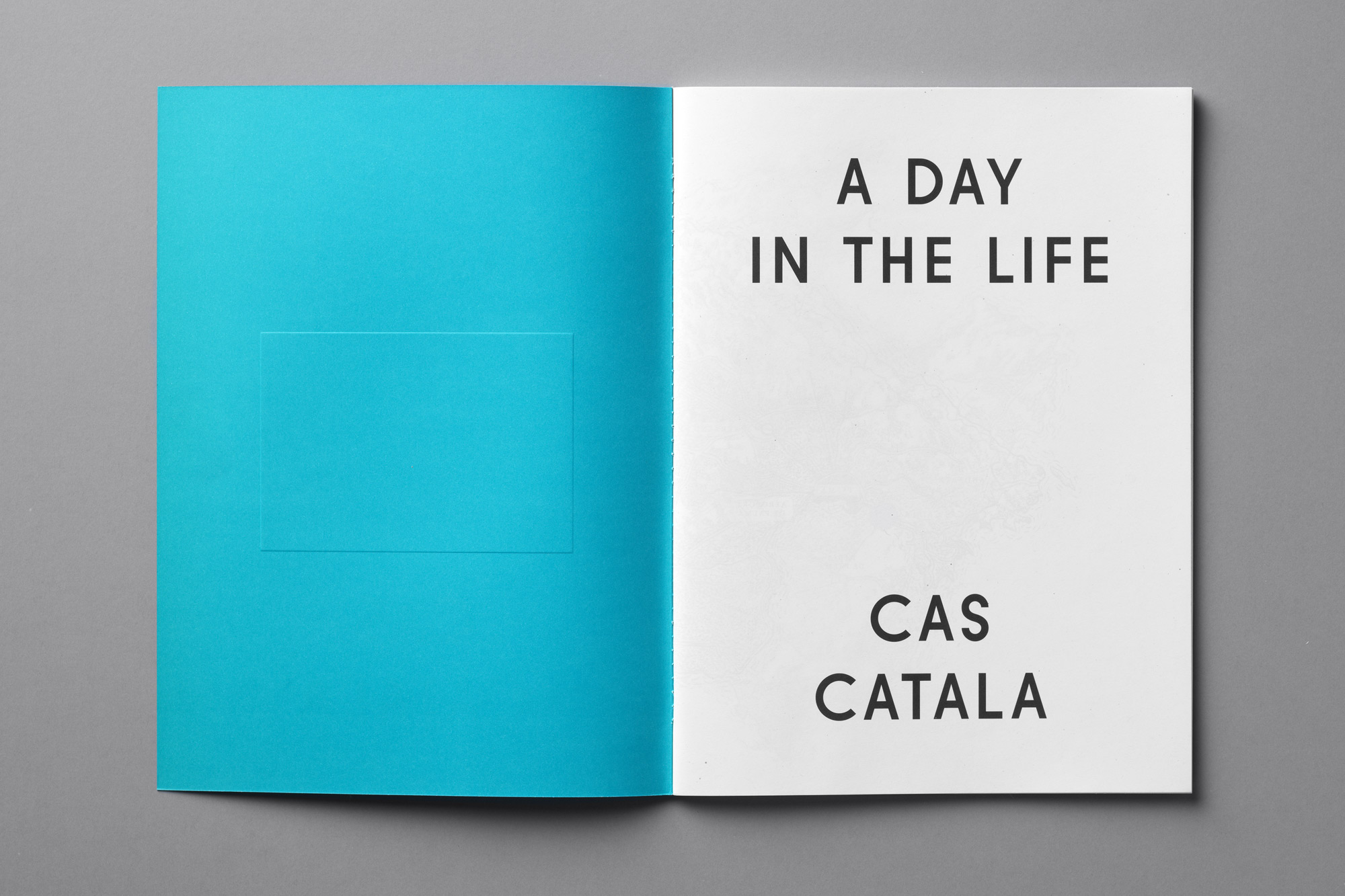
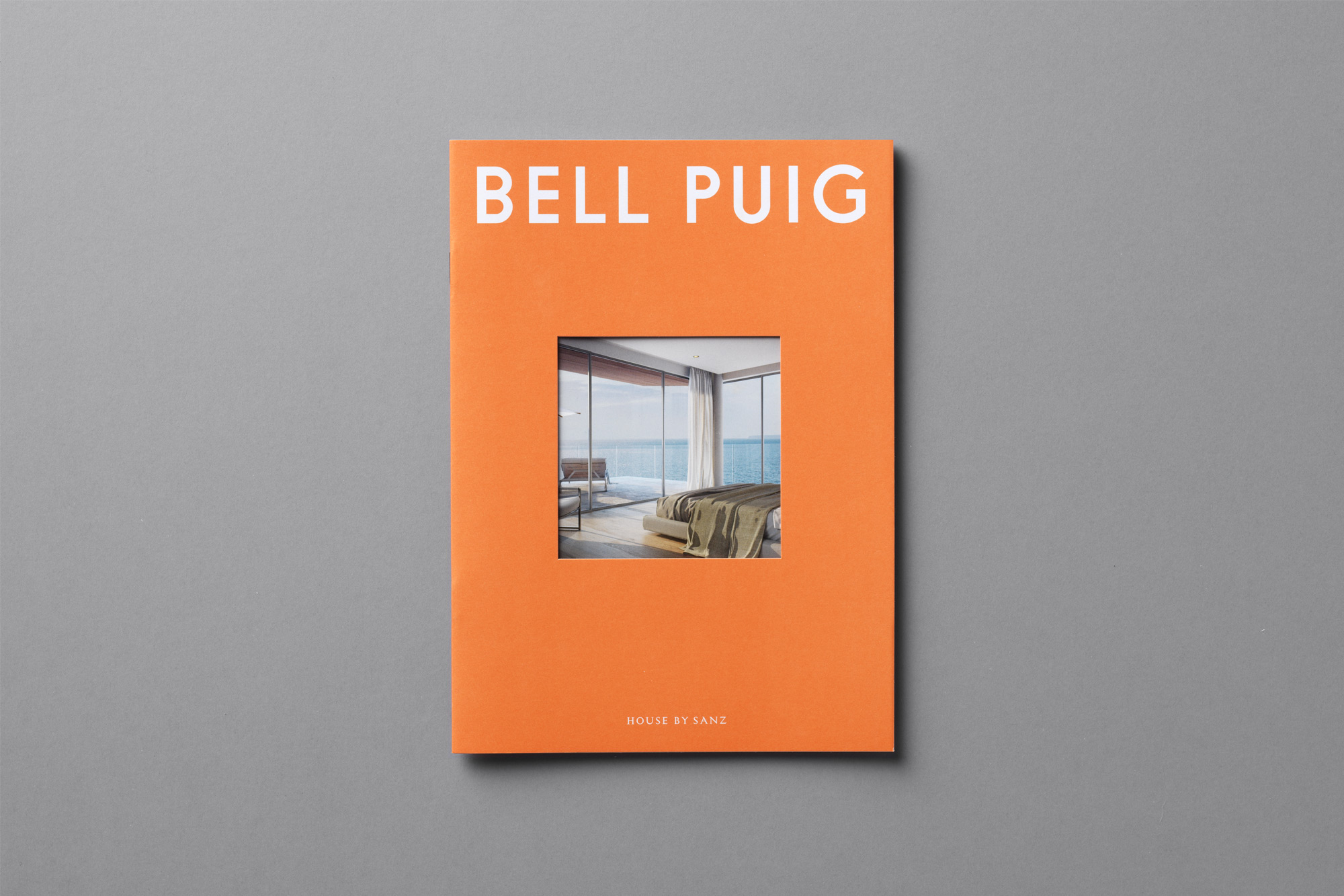
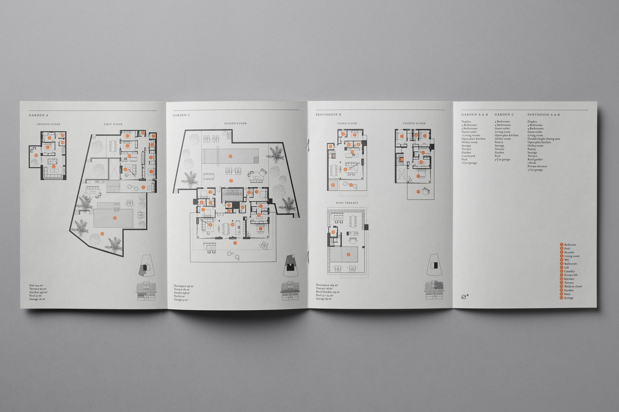
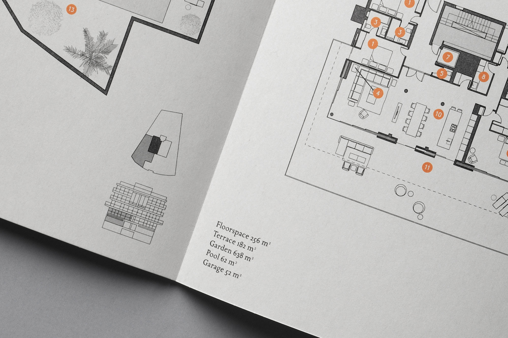
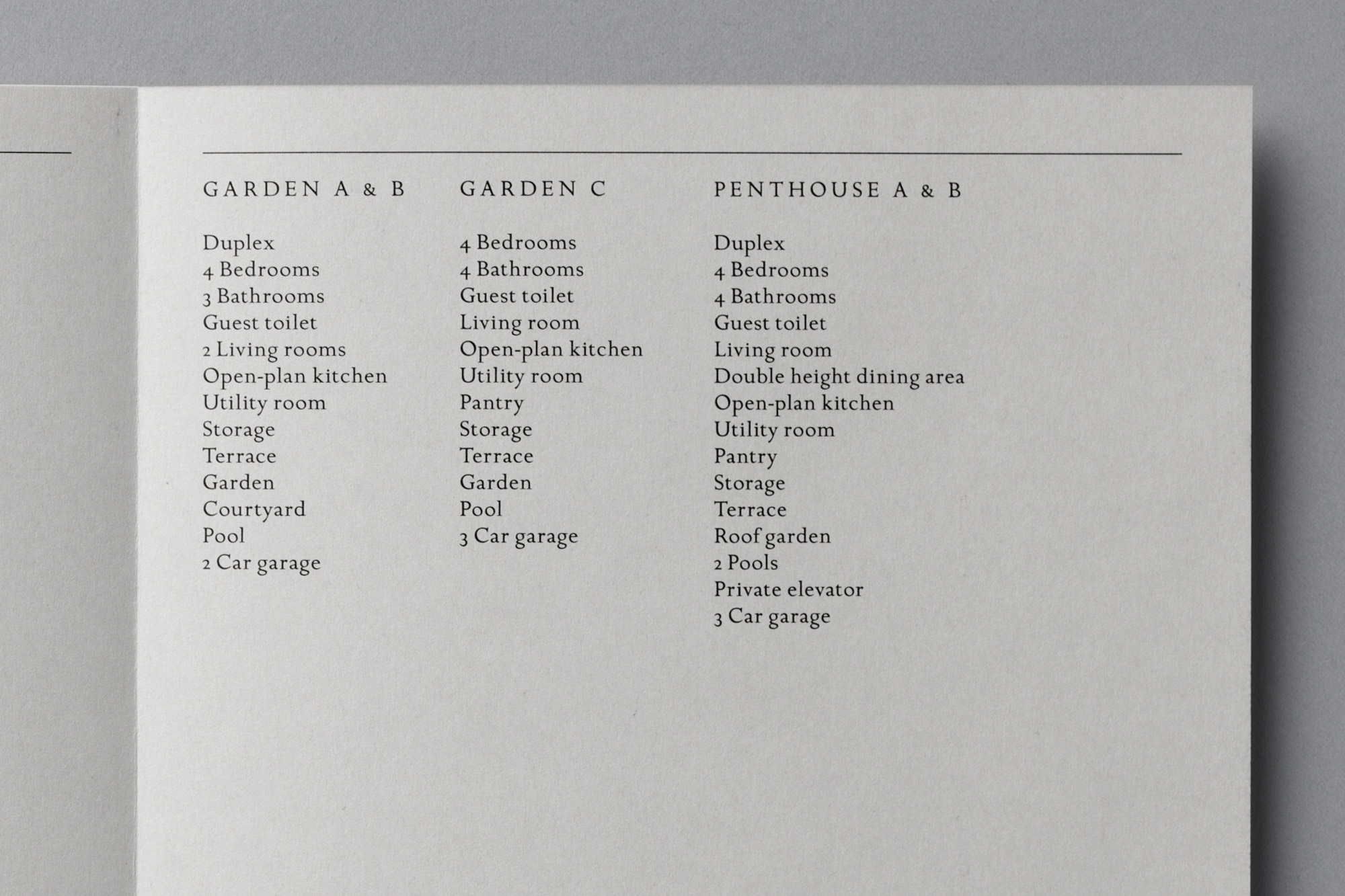
Conceptual brand book with an overview of the developer and development for prospective buyers
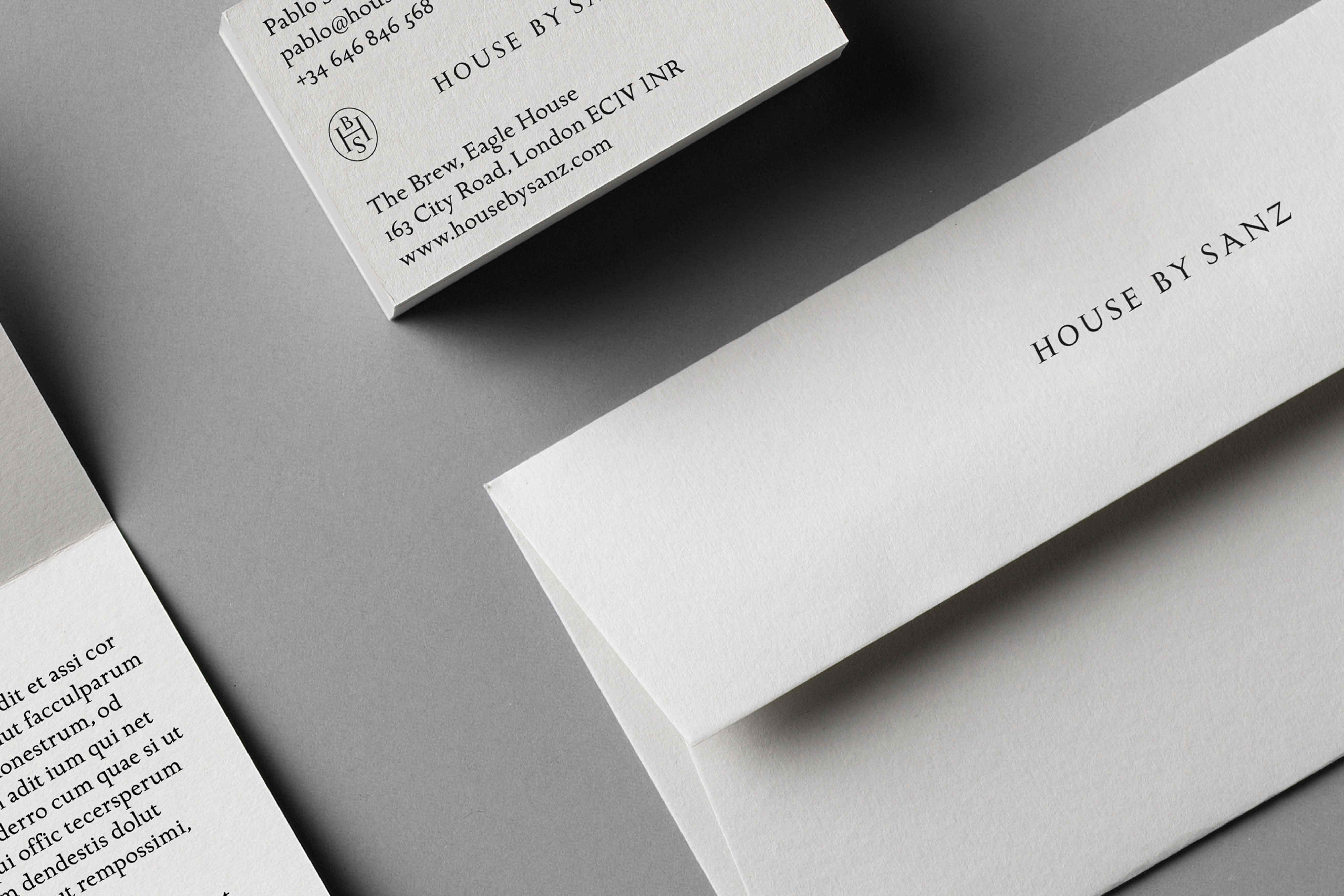
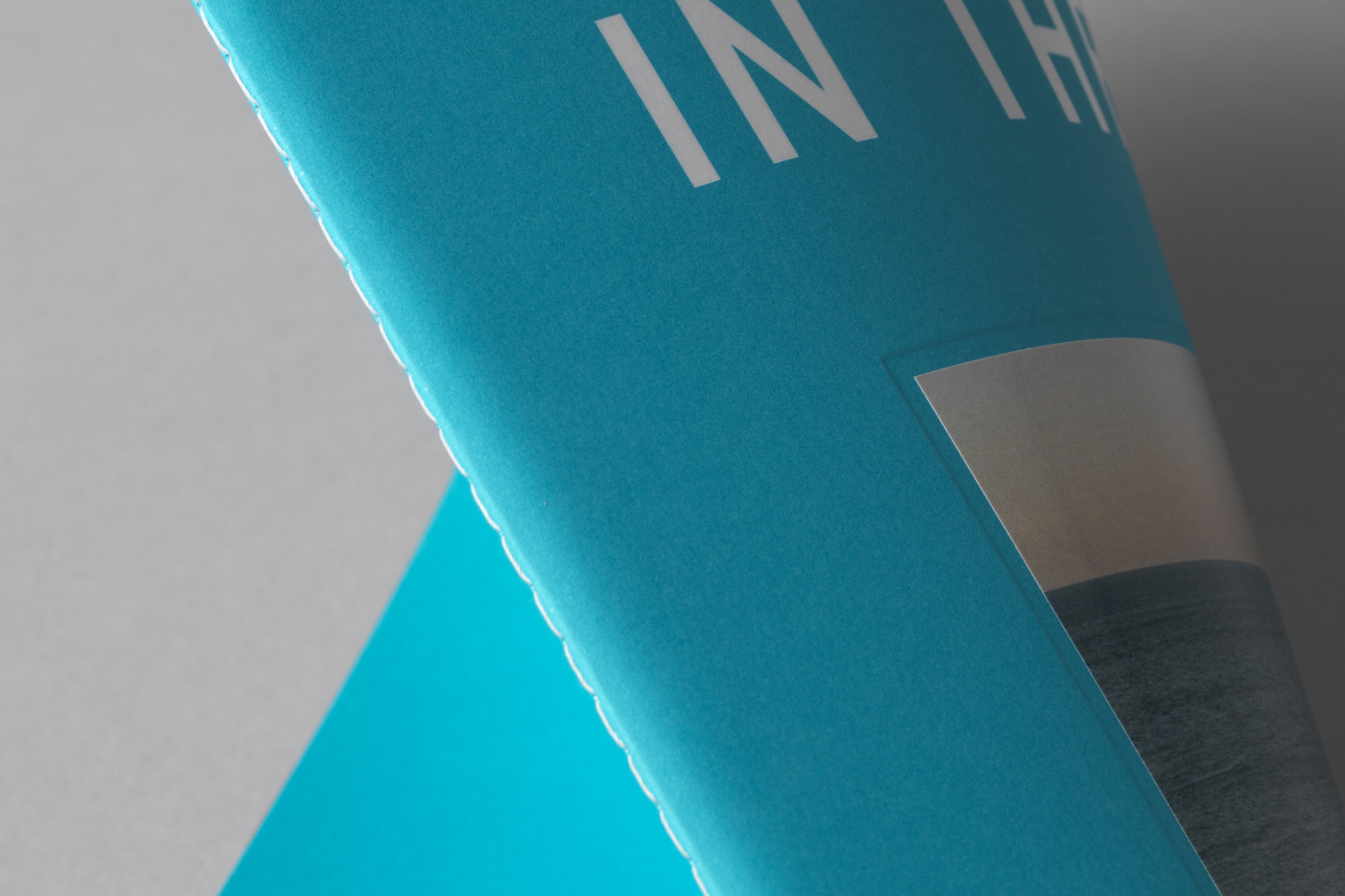
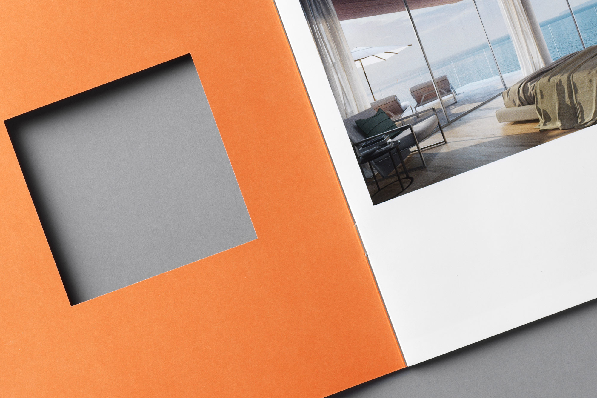
Bespoke papers including saddle sewn binding, embossing and hand-tipped techniques
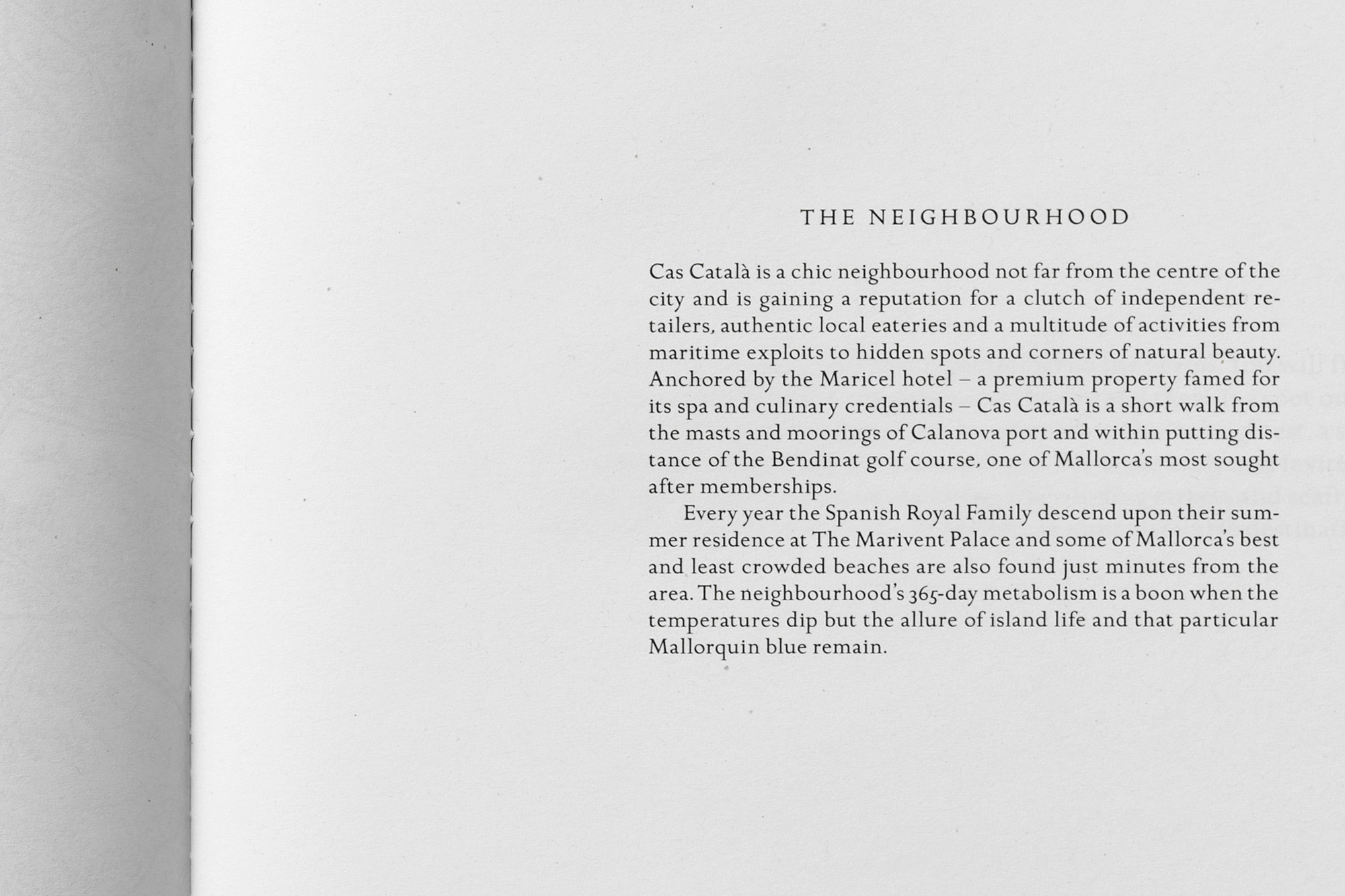
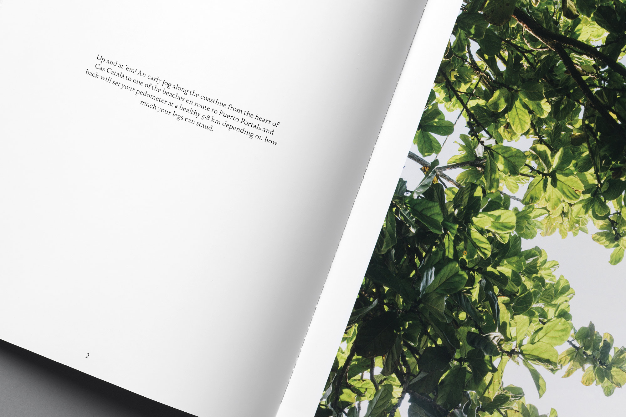
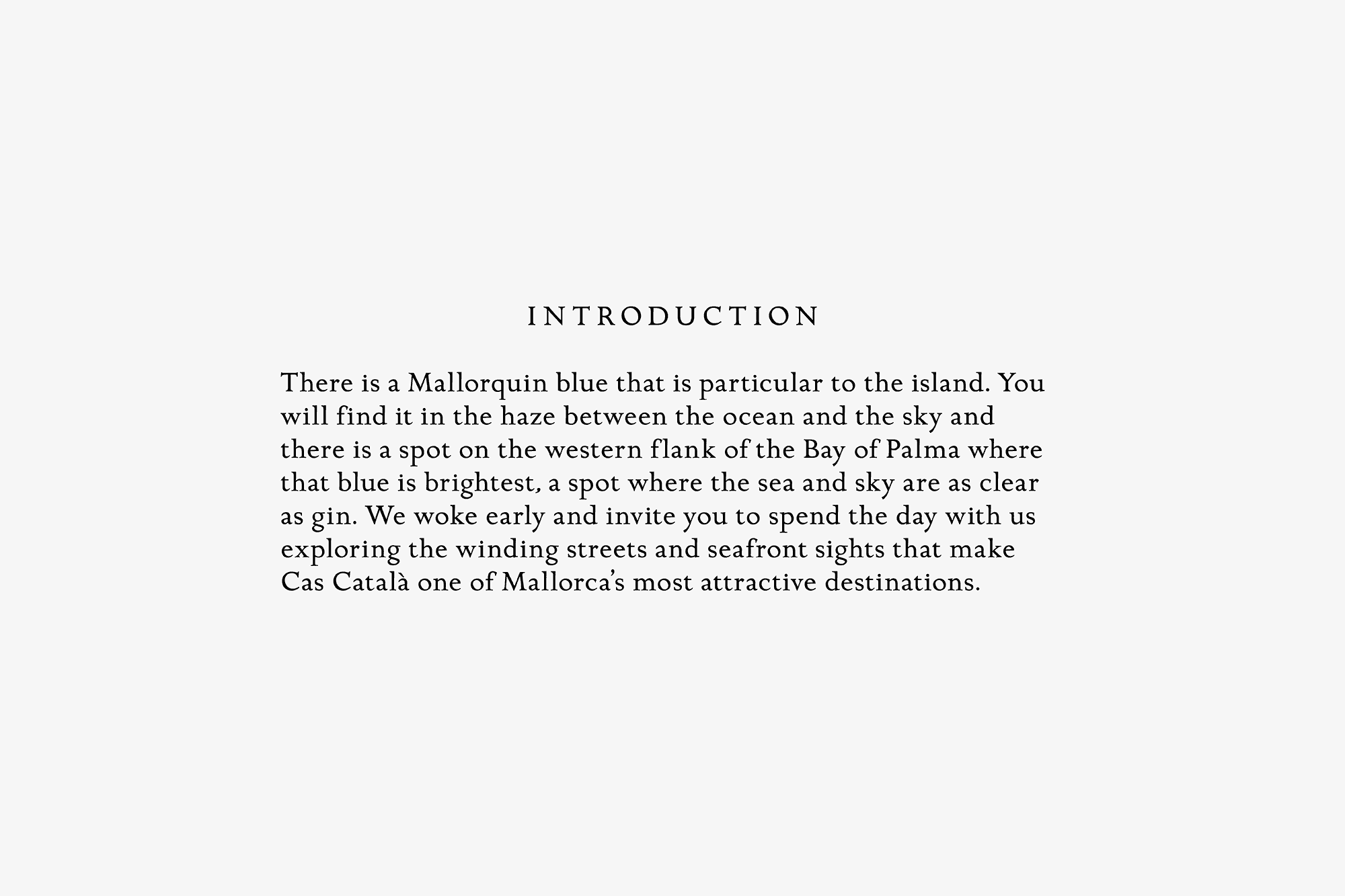
Benefits of living in the property are brought to life with an atmospheric tone of voice

Promotional marketing collateral for all the individual developments
Large-scale promotional collateral inspired by vintage modernist travel posters
Deliverables included: Art Direction, Brand Strategy and Creation, Digital Design, Graphic Design, Content and Editorial Design, Tone of Voice Development. Project photography by Salva Lopez. Portfolio photography by Alexander Crispin.